The Use of Colors in Visual Space Optimization Enhance Your Design
Exploring Color Theory and Its Role in Design
Colors are more than just visual stimuli; they significantly influence how we perceive, feel, and interact with our surroundings. In various design disciplines, color is not just a decorative choice—it is a vital component that can enhance both functionality and aesthetic appeal. For individuals ranging from professional designers to homeowners embarking on decorating projects, a firm grasp of color theory can optimize the visual experience in any space.
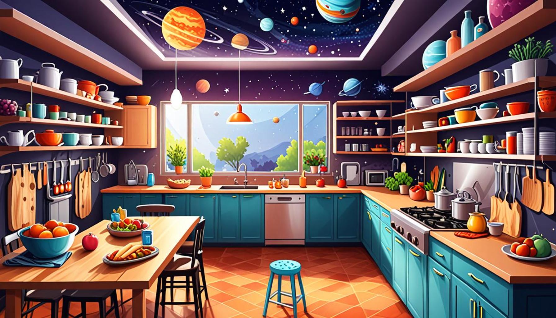
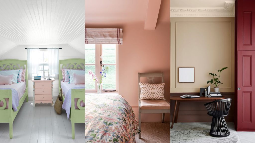
When considering color, one must recognize its psychological effect. Different hues evoke distinct emotions and moods. For example, the serene shades of blue can promote tranquility and reduce feelings of anxiety, making it an ideal choice for bedrooms and relaxation areas. On the other hand, the boldness of red can energize a room, often used in spaces where lively interaction is desired, such as kitchens or dining areas. The psychological implications of color extend to consumer behavior as well, as companies often select specific colors to resonate with their target audiences. Retail stores frequently utilize vibrant colors to entice customers, enhancing the shopping experience and encouraging purchasing decisions.
Moreover, the use of color significantly impacts spatial perception. Light colors, like soft pastels or whites, can create an illusion of expanded space. This principle is particularly valuable in small rooms, where selecting lighter shades can make the area feel more open and airy. Conversely, darker colors can produce a sense of warmth and intimacy, making larger spaces feel cozier and more inviting. This strategic application of color helps to not only beautify a space but also cater to the functional needs of its occupants.
In addition to influencing emotions and perceived space, color plays a crucial role in brand recognition. Businesses often rely on their signature colors to establish an identity in a competitive landscape. Companies like Coca-Cola and McDonald’s have effectively utilized distinctive colors to evoke familiarity and loyalty among consumers. The psychology behind this phenomenon reveals that colors can forge stronger connections between a brand and its customers, thereby enhancing visibility and memorability.
Furthermore, adept use of color can effectively guide the viewer’s attention across a designed space, highlighting focal points such as artwork or architectural features. This aspect is particularly relevant in galleries, showrooms, and even online platforms where the design must steer users toward important information or products. In adept hands, color is a powerful tool that can elevate a simple visual experience into an engaging and immersive journey.
As we dive deeper into the realm of visual space optimization, it becomes evident that the mastery of color choices intertwines with successful design techniques. From innovative interior spaces to striking commercial environments, this exploration will showcase various examples and methods that illuminate not only the aesthetic implications of color but also its profound functional impact. As our understanding of color continues to evolve, designers and homeowners alike have endless opportunities to harness this knowledge, leading to enhanced experiences in both everyday life and the broader market landscape.
SEE ALSO: Click here to read another article
Strategic Color Choices for Effective Space Enhancement
The integration of color into design is not simply about creating visually appealing environments; it’s a strategic approach that significantly optimizes the experience within any given space. Understanding how to align color theory with practical design elements can lead to transformative results. Designers and homeowners alike can utilize a well-considered palette to enhance both the function and vibe of a space, ultimately impacting how a room is experienced.
One of the foundational concepts in utilizing color for visual space optimization is the principle of color contrast. By leveraging contrasting colors effectively, designers can create depth and interest while delineating areas for specific activities. For example, using a darker shade on one wall in an otherwise light room can draw the eye and create a sense of structure, marking out spaces for social interaction, work, or relaxation. Contrasting colors can also highlight architectural features, making them stand out as focal points that guide movement through a space.
Additionally, the application of color can play a pivotal role in establishing a flow throughout a space. Here are several key strategies to consider:
- Create harmonious color schemes: A consistent palette that flows from room to room provides a cohesive aesthetic. This unification can be achieved through the use of complementary or analogous colors that work well together.
- Experiment with color blocking: This technique involves using blocks of color to define areas within a larger space. For instance, a bold colored accent wall can visually separate a dining area from a living area while adding a contemporary touch.
- Utilize colors to designate traffic patterns: Applying brighter or warmer colors in high-traffic zones, like entryways, can subconsciously encourage movement and engagement, while cooler, muted colors in quieter spaces invite relaxation.
Moreover, the choice of color can drastically alter a room’s perceived temperature. For instance, colors such as cool blues and greens lend themselves to a fresh ambiance, which is particularly refreshing in sun-drenched areas. On the flip side, warm tones like orange and yellow can evoke feelings of warmth and coziness, making them ideal for intimate settings. Understanding these nuances allows designers to manipulate the emotional climate of a space through color selections.
From a practical standpoint, the maintenance of color balance is paramount in achieving overall visual optimization. While vibrant and bold colors can attract attention, an overload of such hues can lead to visual clutter. Designers often recommend adhering to the 60-30-10 rule in color distribution: 60% of the room should be a dominant color, 30% a secondary color, and 10% an accent color. This approach not only regulates visual space but also ensures that no single color overwhelms the design.
In conclusion, the skillful application of colors goes far beyond mere decoration; it is an instrumental component in enhancing design through visual space optimization. By understanding color relationships, designers can create functional spaces that resonate emotionally with occupants while achieving a well-balanced aesthetic. With a thoughtful approach to color, every room can become an engaging canvas contributing to a favorable overall experience.
| Color Psychology | Emotional Impact |
|---|---|
| Understanding color associations | Colors evoke specific feelings and responses |
| Brand Recognition | Consistent color usage boosts memorability |
| Visual Hierarchy | Guides viewers’ attention effectively |
| Functional Design | Improves usability and overall experience |
In the realm of visual design, the application of colors plays a pivotal role in engaging the viewer. Color psychology, for instance, delves into how different hues affect human emotions and perceptions. This knowledge aids designers in choosing colors that not only enhance aesthetic appeal but also evoke the desired emotional response from the audience.Furthermore, utilizing a consistent color palette can significantly improve brand recognition. Studies show that consumers are more likely to remember brands whose visual designs employ specific colors frequently. This principle extends to visual hierarchy, where strategically placed colors can guide the viewer’s attention, ensuring that the most crucial information stands out effortlessly.Another aspect to consider is how color influences functional design. A well-chosen color scheme can enhance usability, making navigation intuitive and enhancing user satisfaction. By incorporating these elements into design projects, creators not only enrich the visual experience but also foster deeper connections with their audience. As the understanding of color’s impact evolves, so too does the potential for innovative designs that resonate and endure.
CHECK OUT: Click here to explore more
The Psychological Influence of Color in Space Design
Beyond the aesthetic and functional considerations, the psychology of color plays a crucial role in how spaces are perceived and experienced. Each color possesses unique psychological triggers that can influence mood and behavior, making it essential for designers to harness these properties for visual space optimization. Understanding the psychological implications of color can result in environments that not only look beautiful but also promote desired emotions and actions.
For instance, studies reveal that the color blue has a calming effect, which can enhance productivity in workspaces and encourage focus. This is why many corporate environments incorporate varying shades of blue into their palettes. Cool colors like green are also known for their restorative properties, often used in healthcare settings to create a soothing atmosphere that fosters healing. On the contrary, vibrant colors such as red and orange can stimulate energy and appetite, making them suitable for restaurants and kitchens.
Additionally, the cultural context of color should not be overlooked. Different cultures attribute various meanings to colors that can impact design choices. For example, while white is traditionally associated with purity and simplicity in Western cultures, it can signify mourning in some Eastern societies. As a result, it is vital to tailor color selections to suit the demographic and cultural background of the intended audience.
Another compelling aspect of color use in design is its ability to influence the perception of space. In smaller rooms, utilizing lighter colors can create an illusion of expansiveness, making the area feel more open and inviting. Conversely, using darker shades can lend a sense of intimacy and make expansive areas feel cozier. This strategic manipulation of colors allows designers to effectively alter space dimensions in the perception of residents and visitors alike.
The integration of color can also prompt behavioral responses, particularly in commercial spaces. Research indicates that the use of specific colors can lead to increased dwell time in retail environments. For example, stores that employ warm tones and engaging accents tend to attract shoppers, encouraging them to explore products longer. This phenomenon can be understood through the theory of color branding, where specific hues become synonymous with certain brands and influence consumer behaviors. Retailers are therefore advised to carefully consider their color schemes to align with brand identity and target customer responses.
Moreover, advancements in technology have made it easier to simulate colors in the design process. Virtual reality (VR) and augmented reality (AR) applications allow designers and clients to visualize how different colors interact and affect spatial dynamics, leading to informed decision-making. This tech-driven approach to color optimization not only streamlines the design process but also enhances the client experience by allowing for greater customization and adaptability.
In essence, effective use of color transcends mere decoration; it incorporates psychological understanding and cultural nuances to create optimized spaces. By utilizing color as a powerful tool for emotional resonance and perception, designers can craft environments that are not only visually appealing but also immensely functional and engaging.
SEE ALSO: Click here to read another article
Conclusion: Unlocking the Power of Color in Design
In summary, the thoughtful application of color in visual space optimization is a transformative aspect of design that extends beyond mere aesthetics. The intricate interplay between color psychology and cultural significance has the potential to significantly influence human emotions and behaviors within a space. By understanding the nuances of color, designers can create environments that foster productivity, healing, and overall well-being. Whether through soothing blues for workplaces or invigorating reds in dining settings, the strategic selection of color can alter how a space is perceived and experienced.
Furthermore, the ability of color to manipulate spatial perception introduces a new level of innovation for interior design. Designers can leverage lighter shades to enhance small spaces and darker tones to instill comfort in larger areas, appealing to both functionality and comfort. In commercial spaces, the right palette can guide customer engagement, encouraging them to linger longer and interact more with products. Thus, retailers and designers alike are urged to delve deeper into color theory to establish a strong brand identity while maximizing customer connection.
As technology continues to evolve, tools such as virtual reality offer unprecedented insights into the spatial effects of color choices, making it easier than ever to visualize outcomes before making decisions. Ultimately, embracing a comprehensive approach to color not only enhances the visual appeal of a space but creates environments that resonate with people on multiple levels. As the field of design advances, the exploration of color remains a vital element, offering endless possibilities for creating optimized spaces that inspire and elevate everyday experiences.